 According to a recent study published in the Journal of Food Science, the color of a sweetener packet has a direct effect on an individual’s sweetness perception and overall satisfaction.
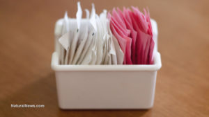
In the study, a total of 500 participants were given five different sweeteners, each a different color. Sucralose was in a yellow packet, stevia was in a green packet, saccharin was in pink packet, aspartame was in a blue packet, and sucrose was white. Some of the subjects were given packets that only had the brand name written on it, and other subjects were given packets that had both the brand names and colors. For each of the conditions, subjects were given five identical tea samples, which were rated for sweetness and overall liking and emotions.
The Louisiana State University researchers found that the color of sweetener packets alone was enough to influence sweetness perception. The subjects rated sweetness liking and overall liking higher for sucrose (in the white packet) than for non-nutritive sweeteners. In other words, the sweeteners that had only the brand name on them elicited different reactions than the sweeteners that had the name with color. (RELATED: Learn about how the sugar industry promotes obesity, diabetes, and heart disease).
Sweetness liking was found to be significantly linked to the emotion “satisfied” for saccharin (pink) and sucralose (yellow) for packets that were not colored. However, among the packet and color conditions, sweetness liking was strongly correlated with the emotions “satisfied” for sucrose, “disgusted” for aspartame, and “pleased and satisfied” for stevia. In other words, the study demonstrated that imagery and color had more of an impact on subjects’ reactions than the actual taste of the sweeteners. (RELATED: Read about a new study that shows a correlation between aspartame in diet soda and health issues)
This is just one of many studies published in the past that show how big of an impact visual factors such as color have on overall perception. Another study that was published in the Journal of Food Science found that drink flavors were harder to identify when they didn’t have the appropriate color. For example, a cherry-flavored drink that had been dyed orange was said to have tasted like an orange drink. Similarly, a green colored drink was thought to taste like lime, even though the real flavor was cherry.
Another more complicated study, conducted in the 1970s and published in Fast Food Nation, found that food that was visually manipulated was correlated to appetite. Subjects were served a normal looking plate of steak and fries, which they all thought tasted fine. What they weren’t told, however, was that the only reason the food looked normal was because of the subtle lighting effects in the room. Once the lighting effects were turned off, it was revealed that the steak was dyed blue and the fries were dyed green. Many of the subjects suddenly refused to eat anymore and some even got sick.
Rene Ficek, Lead Nutrition Expert at Seattle Suttons Healthy Eating, offered a bit more insight on the correlation between food visuals and appetite. “We eat first with our eyes, so its no wonder that color and the appeal of various foods is also closely related,” she said. “The smell and sight of food fires neurons in the hypothalamus, giving all sorts of feedback.”
For instance, red food is known to spike appetite, while red plates suppress it. According to Rebecca Lewis, in-house R.D. at HelloFresh, “foods that are red are found to stimulate appetite. However, research has shown that those who eat off of red plates tend to eat less when compared to other plate colors.”
Other food colors have different effects. Green food is known to keep cravings under control, blue foods help prevent emotional eating, and yellow food boosts mood and appetite
Natural News DT

